Personalizing Instagram Stories for Meaningful Viewing
Independent Case Study - Spring 2021
Overview
You have some down time and, out of habit, find yourself opening up Instagram. You click on the first thing you see: that tempting, glowing red circle dominating the top of your home page. You skip and skip one too many times. Then, finally, it’s over and the Stories feature comes to a close.
Instagram Stories are broken. 💔
When Stories were first introduced to Instagram, users were excited to finally share temporary content on a platform that emphasized permanence since its release. However, since the feature’s launch in 2016, many users have come to find themselves unsatisfied with the content they see in stories.
Too often, users find themselves robotically clicking and skipping through stories. A process that was once exciting and new has now become lifeless and repetitive. My original hypothesis to this problem was: If Instagram Stories de-cluttered its layout, users will be more inclined to engage with story content.
Final Prototype ✨
With the motivation to re-invigorate meaningful viewing for Instagram Stories, I designed the end-to-end experience for a new feature on the app called the Top Stories Page. Below is a sneak peek of my final prototype:
Now, let’s dive into how I actually got there…
Understanding Why Users are Uninterested in Stories
User Research
My goal was to identify key pain points in interacting with Instagram’s story feature. Here are some key insights:
Users usually don’t care to watch stories of followers they’re not close with.
“I only look at stories for people that I care for and actually know.”
2. Users value simplicity and the endless scroll of stories doesn’t achieve this for some.
“I usually stop after looking at the first few stories because it gets really overwhelming and I’m generally not interested in what’s going on in their lives.”
3. Users prioritize and enjoy content that feels curated and personalized for them.
“I don’t really want to read through all of them; most people don’t post anything interesting.”
People Want to Engage With Relevant Content ✔️
At first, I thought that users didn’t engage with stories because the feature’s layout was too cluttered. However, I discovered that when viewing stories, users also valued having quick access to meaningful and engaging content. With this refined approach, I revised my people problem:
Users want to feel connected to those they value through stories, but they can’t do that well because:
1) Users tend to look at stories robotically since they aren’t interested in much of the content being posted.
2) Most of the stories on their feeds are by users they don’t have valued connections with.
Figuring Out Which Feature to Implement
Brainstorming Process
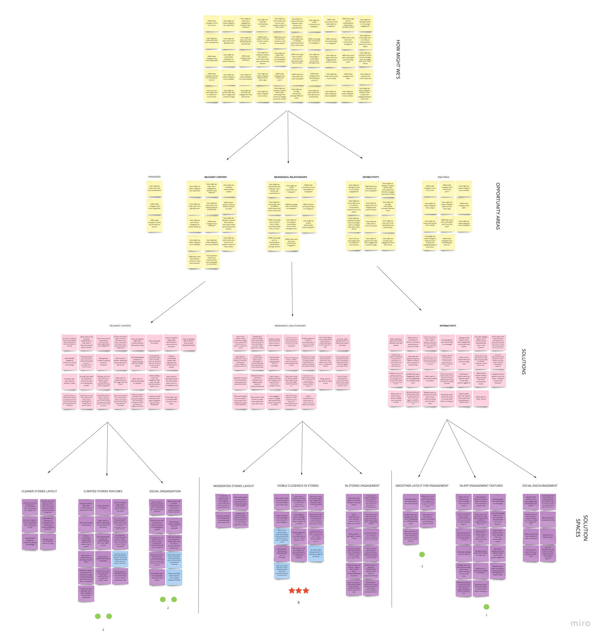
Brainstorming session with friends! Post-it board →
I recruited my friends, Sally and Kevin, as my brainstorming buddies. We ultimately discovered three main opportunity areas:
Relevant Content: How might we help users feel like their content is more personalized?
Meaningful Relationships: How might we make connections more meaningful on Instagram?
Interactivity: How might we encourage interactivity among users’ stories?
Feature 1: Group Stories
Group stories allows multiple users (i.e. a friend group) to add to one collective story. It would encourage users to engage more deeply with and easily access content from users they value.
I discovered during this initial sketching process that Instagram had completed beta testing for this exact feature.
Feature 2: Streaks for Stories
Mirroring streaks on Snapchat, users who consistently engage with another user’s story will have their “closeness” represented via colored circles.
However, this would likely only increase meaningless engagement, going against my people problem. It also has low feasibility given engineering constraints to developing an algorithm for “streaks.”
Feature 3: Trending Stories Page
The trending stories page features stories with high user engagement among a user’s followers on a separate page.
This feature is highly feasible as it builds upon Instagram’s existing stories and trending hashtags layout. It is also high impact as it offers a strong social aspect to stories, encouraging users to engage more with popular stories, and de-clutters the story layout.
Encouraging Meaningful Viewing for Users
After analyzing key findings, I decided to pursue the trending stories page with high feasibility and high impact. I then conducted market research to get a better grasp of how other products utilize similar trending pages to emphasize personalization for users.
How Other Products Implement Personalization and Meaning
Market Research for Trending and Pinning Features
Many other social media platforms currently make use of trending features for their users, with a priority placed on emphasizing the “popularity” of the content being shown with other users.
While exploring other applications, I decided to develop my idea one step further to also tackle the second point of my people problem via a pinning feature, which would enable users to have convenient access to the content they prioritize most.
Mid-Fidelity Screens for a Top Stories Page
Applying my analysis from the market research, I decided to combine the concepts of pinned and trending stories and drafted a Top Stories Page.
Mid-Fidelity Screens
After brainstorming a number of content requirements for this feature, I decided on the following: pinning abilities, pinned and trending stories, and a Top Stories Page that those stories would call home.
Determining Visual Layout
I explored several different options for the layout of stories on the Top Stories Page, including a single-layer layout, multi-layer option, and one that presented story previews.
Explorations for Top Stories Page Layout
A was visually consistent with the existing stories layout, but required too much horizontal scrolling and failed to respond to the issue of users feeling overwhelmed with the current layout. Meanwhile, C was not consistent with Instagram’s current story UI, leaning closer to Instagram Reels.
I ultimately decided on B as it both de-cluttered the stories layout by removing the horizontal scroll option and emphasized usernames and icons. In this way, it also aligned with my findings that users care more about who is posting the content as opposed to the story content being posted (which C failed to do).
Maximizing Consistency with Instagram’s UI
As I iterated through my designs, I prioritized consistency with Instagram’s current design systems.
Explorations for Pinning Message
When determining the proper confirmation message for unpinning a user’s story, I decided to go with C, as it was not only reflective of Instagram’s brand colors, but also made logical sense to be red for the “negative” action (unpinning) being committed.
Crafting UI Elements for Top Stories Feature
After studying existing features and icons on Instagram, I created a UI kit for my feature that again prioritized consistency with the app’s UI and clarity in each element’s meaning to the user.
UI Inspiration from Instagram and UI Kit
I also decided to create visual design explorations for the Top Stories Page icon, drawing inspiration from existing icons on Instagram (namely the icon that appears for a hashtag a user follows).
Explorations for Top Stories Page Icon
Among the explorations above, I decided on B, as it most closely followed Instagram’s story design interface while also being visually distinct from other “normal” stories given its cyan color and clear pin icon.
Responding to User Feedback
At this point, I conducted another round of user testing with 3 users to receive feedback on my designs and discovered the following points:
Users enjoyed easily viewing their most prioritized stories in one place.
Users felt restricted at only having one entry point to pin a user’s stories (from the Home Page).
Users expressed confusion as to what “trending” stories actually was.
The feedback confirmed the effectiveness of my feature at tackling my people problem, enabling me to continue the design process with more confidence in the impact of my design. I also made the following tweaks to enhance the final experience and interaction of my feature.
Discovering Extra Entry Points
Since users expressed frustration at the lack of entry points to the action of pinning a user’s stories, I explored additional entry points for this interaction.
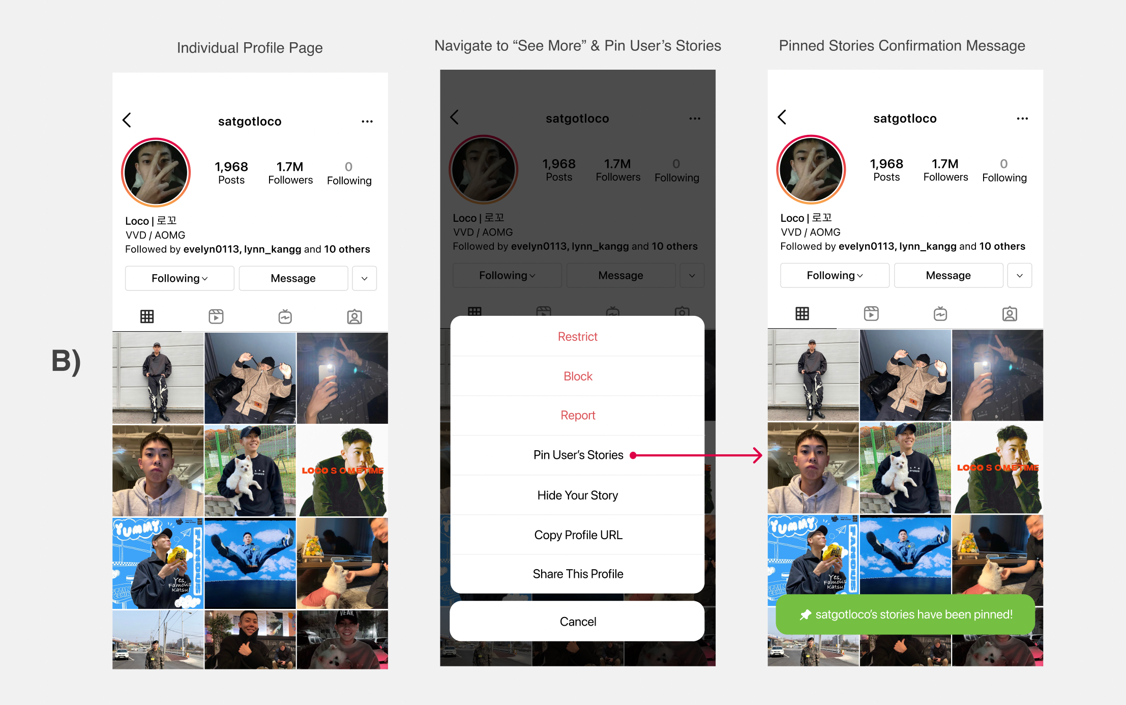
Initially, the entry point to pin a user’s story was only from the Home Page by opening a user’s story (Entry Point A).
I explored a second entry point of pinning stories from a user’s profile page (Entry Point B), but also considered creating a third entry point that would be directly from the Top Stories Page that simplifies the number of steps a user would need to take to commit this action.
In addition to these additional entry points for the action of pinning users, I crafted the Your Pinned Stories List, as shown below. I explored and created the flow for the ability to both add and remove users from one’s Pinned Stories List.
Removing a Pinned User via Your Pinned Stories List
With Your Pinned Stories List, users can easily navigate to the “see more” option at the top right of the Top Stories Page to view a collection of all of their pinned stories and edit their list accordingly.
Ensuring Clarity in New Features
Several users expressed confusion at what the “trending” section of the Top Stories Page was and had to be explained in what ways it was relevant to them.
Explanation of Top Stories Features
As shown above, I decided to add a brief explanation that clarifies what this feature is at the top of the page to explain how this page works and is relevant to users.
Final Interaction for Top Stories Page ✨
The final interaction includes a simple way of navigating to a page that displays story content that are more personalized and meaningful to users. Users are able to easily pin and unpin users’ stories via opening up an individual story or navigating to Your Pinned Stories List, and also discover new trending content that may be of interest to them.
Unpinning User’s Stories from Top Stories Page
Final Prototype ⤵️
Reflection ✍🏻
What I Learned
This was my first time designing the end-to-end experience for a feature that I owned from beginning to end and it was definitely a difficult but highly rewarding journey. I learned that designing is by no means a linear process, and that I should always be iterating my designs to respond to critique and user feedback.
I also learned about the importance to stay consistent with a platform’s UI, especially with a platform like Instagram with such strong and distinct branding. While it’s fun to be creative with my own styles, designing within an existing system is a vital skill for when I enter industry.
Looking Forward
In the future, I wish to explore more higher-level explorations as opposed to just visual explorations. I also want to tackle the interaction between Close Friends and the pinning feature I created, which may help craft this new feature into one that can be both smoothly embedded into Instagram’s existing information architecture but also distinct from other features.
Instagram is the insanely popular social media platform it is today for a reason. However, it may be rewarding to explore how the stories feature can be redesigned to have more emphasis on personalization. Users may feel much more connected to the content they see on stories with a design that truly encourages interactivity and focuses on users’ preferences.
Note: This is a case study for the course “Introduction to Digital Product Design”. I am in no way affiliated with Instagram.
🖋 Interested in exploring more of my work? Check this out.


